
Authoring a Custom Aino Theme

An Aino Desktop theme is a local JSON file. It can define separate light and dark surfaces, text colors, accents, borders, corner radii, fonts, controls, shadows, and motion without installing a plugin or executing CSS or JavaScript.

Start from an existing color scheme

  1. Open Settings → Appearance.
  2. Scroll to Create your own theme, then choose a preset or fine-tune the colors below.
  3. In step 2, Create the theme, select Copy creation prompt, paste it into any AI, and add the mood, colors, and reference style you want. The prompt already includes your current theme JSON.
  4. Save the complete JSON returned by AI as a .json file. For manual authoring, select Export Colors and edit the exported template instead.
  5. Select Import Colors, choose the edited file, then select Preview theme to inspect light and dark text, sidebars, and controls.
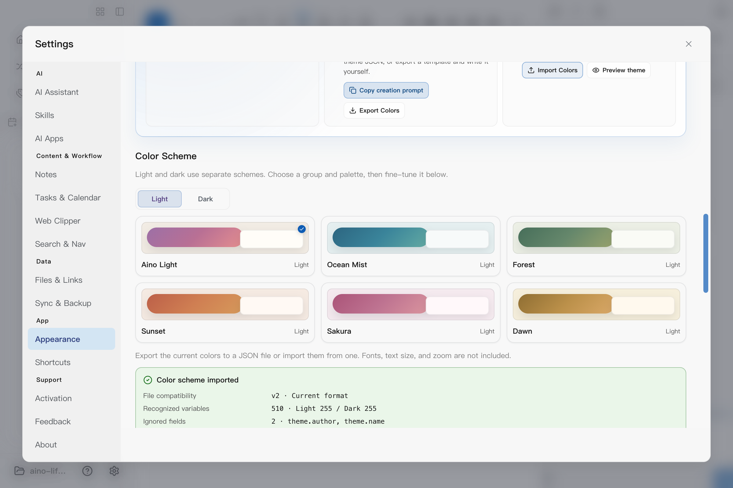
Three-step theme authoring guide, AI prompt, import and export controls, and color presets in Aino Desktop Appearance settings

The Theme variables guide link opens this page. Selecting a built-in color scheme removes imported semantic-token overrides and returns to a built-in theme that you can fine-tune.

After a successful import, Aino shows a diagnostic summary: whether the file uses current v2 or legacy-compatible v1, how many light and dark variables were recognized, and which extra fields were ignored. A recognized count of zero means that the file contains only base colors, so only a limited set of interface colors will change. Diagnostics show field paths, never field contents.

Unknown or invalid theme variables are not ignored: they reject the whole import to prevent a hard-to-detect partial theme. $schema is a supported editor hint and is not listed as an ignored field.

Preview your theme

Select Preview theme in step 3 to inspect navigation, tabs, headings, body text, quotes, code, task checkboxes, inputs, buttons, toggles, sliders, tooltips, and menus together.

Use Light and Dark to switch the preview scheme. Type in the input, click the toggle, or drag the slider to inspect interaction states. The preview uses sample content and does not change notes, your current appearance mode, or personal settings. Press Escape or the close button to return to Appearance settings. Also check your everyday search, task, and calendar views after previewing.
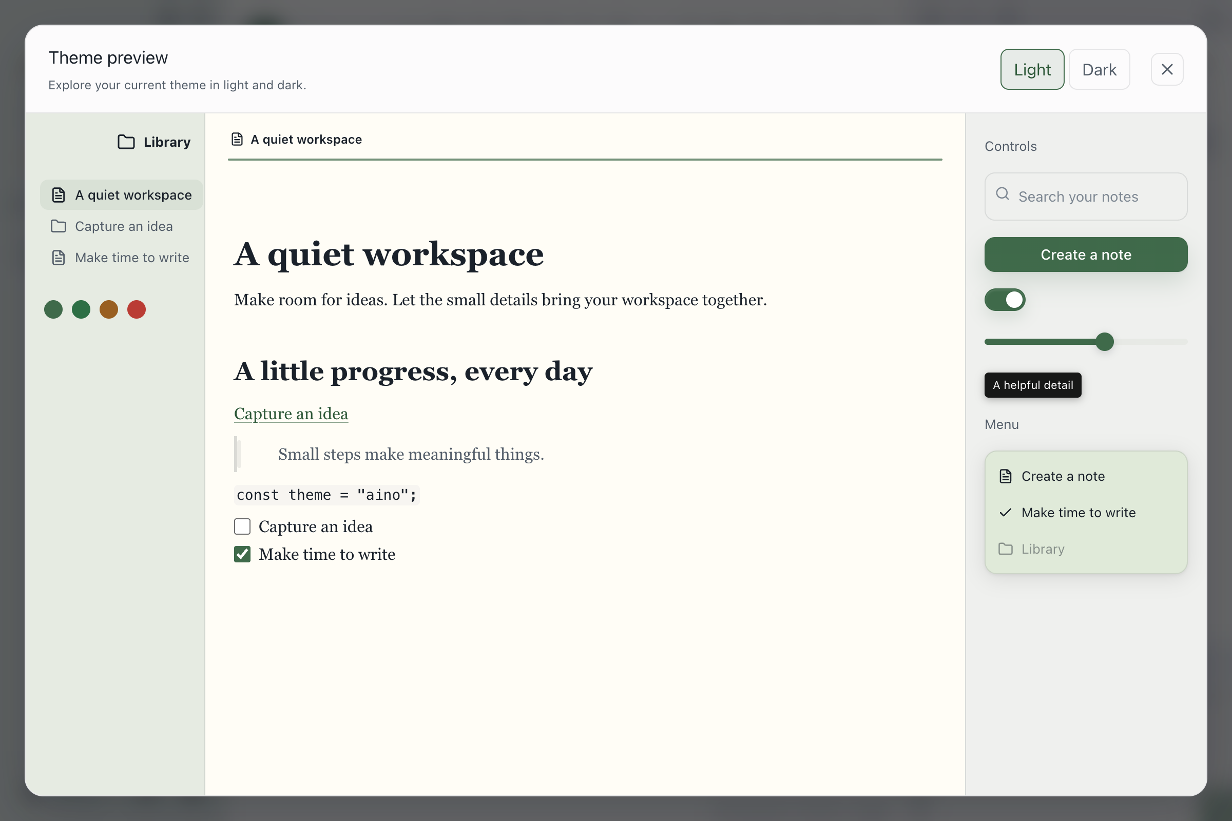
Isolated Aino Desktop theme preview with light and dark schemes and interactive controls

Variable reference and editor completion

The theme variable reference lists every supported variable, its type, and valid examples, generated from the same definitions used by Aino. To enable completion in compatible editors, add this top-level field to your theme JSON:

"$schema": "https://aino.md/schemas/appearance-theme.v2.schema.json"

You can also download the JSON Schema for offline use. The schema checks structure, names, types, and basic literal syntax; Aino import additionally validates numeric ranges inside color functions, shadows, and other strings.

Schema titles and value descriptions support all nine interface languages. English retains the original default URL; see the variable reference for Simplified Chinese, Traditional Chinese, Japanese, German, French, Spanish, Portuguese, and Arabic versions. Every version uses the same validation rules.

Generate a theme with AI

The Copy creation prompt action in step 2, Create the theme, includes your current theme as a starting point. It asks AI to preserve Aino's file format, design both light and dark schemes, use only supported variables, and return only complete import-ready JSON.

After pasting the prompt, replace its style placeholder with a specific request, for example:

Low-saturation warm paper surfaces; stationery-inspired light mode and eye-friendly dark mode; ink-green headings, muted blue links, and body-text contrast as the priority.

If AI wraps its response in a Markdown code fence, copy only the JSON inside it. When import fails, use the error message to check for unknown variables, invalid colors, trailing commas, or missing fields.

Complete theme file

Save the following example as my-aino-theme.json and import it directly:

{
  "format": "aino-appearance-theme",
  "version": 2,
  "meta": {
    "name": "Deep Focus",
    "author": "Theme Author"
  },
  "theme": {
    "mode": "system",
    "accentColor": "#5aa7c5",
    "gradientEnabled": true,
    "accentSecondaryColor": "#7c88cf",
    "accentTertiaryColor": "#d17fa4",
    "backgroundColor": "#f4efe7",
    "editorBackgroundColor": "#fffdf9",
    "markdownBoldColor": "#1b2430"
  },
  "schemes": {
    "light": {
      "tokens": {
        "--background-primary": "#fffdf9",
        "--background-secondary": "#eee8df",
        "--interactive-accent": "#9c5f78",
        "--text-normal": "#25211d",
        "--text-secondary": "#625b53",
        "--background-modifier-border": "#d8cfc4",
        "--h1-color": "#7d3f59",
        "--h1-size": "2.1em",
        "--nav-item-color-active": "#7d3f59",
        "--tab-background-active": "#eee8df",
        "--tab-radius-active": "12px",
        "--button-background": "#fffaf5",
        "--button-background-hover": "#f4e9df",
        "--button-border-color": "#d8cfc4",
        "--button-radius": "10px",
        "--card-background": "#fffdf9",
        "--card-border-color": "#d8cfc4",
        "--card-radius": "14px",
        "--toolbar-background": "rgba(255, 253, 249, 0.86)",
        "--toolbar-backdrop-blur": "18px",
        "--toast-background": "rgba(255, 253, 249, 0.94)",
        "--modal-radius": "20px",
        "--modal-backdrop-blur": "16px",
        "--input-background": "#fffaf5",
        "--input-border-color-focus": "#9c5f78",
        "--input-radius": "10px",
        "--checkbox-color": "#7d3f59",
        "--checkbox-marker-color": "#ffffff",
        "--code-keyword": "#8b4f86",
        "--font-text-theme": "Georgia, serif",
        "--font-monospace-theme": "Menlo, monospace",
        "--font-text-size": "18px",
        "--sidebar-opacity": "0.8",
        "--sidebar-blur": "20px",
        "--menu-shadow": "0 8px 24px rgba(0, 0, 0, 0.12)",
        "--tooltip-radius": "8px",
        "--motion-duration-fast": "120ms",
        "--radius-m": "14px"
      }
    },
    "dark": {
      "tokens": {
        "--background-primary": "#10141c",
        "--background-secondary": "#171d27",
        "--interactive-normal": "#202836",
        "--text-normal": "#f3f6fa",
        "--text-secondary": "#bdc7d4",
        "--text-faint": "#8e9aaa",
        "--color-accent": "#5aa7c5",
        "--color-accent-1": "#7c88cf",
        "--color-accent-2": "#d17fa4",
        "--background-modifier-border": "#394555",
        "--h1-color": "#8ac9df",
        "--code-keyword": "#c7a0df",
        "--button-background": "#202836",
        "--button-background-hover": "#2a3546",
        "--button-border-color": "#394555",
        "--card-background": "#171d27",
        "--card-border-color": "#394555",
        "--toolbar-background": "rgba(16, 20, 28, 0.86)",
        "--toolbar-backdrop-blur": "18px",
        "--toast-background": "rgba(23, 29, 39, 0.94)",
        "--input-background": "#202836",
        "--input-border-color-focus": "#5aa7c5",
        "--font-text-theme": "Georgia, serif",
        "--font-monospace-theme": "Menlo, monospace",
        "--font-text-size": "18px",
        "--sidebar-opacity": "0.8",
        "--sidebar-blur": "20px",
        "--menu-shadow": "0 8px 24px rgba(0, 0, 0, 0.12)",
        "--tooltip-radius": "8px",
        "--motion-duration-fast": "120ms",
        "--radius-m": "14px"
      }
    }
  }
}

Top-level fields

FieldRequiredDescription
formatYesMust be aino-appearance-theme.
versionYesThe current version is 2; Aino can still import legacy version 1 files.
metaNoTheme name and author, limited to 80 characters each.
themeYesBase colors and fallbacks used to generate gradients and any colors that are not overridden.
schemesYeslight and dark are independently optional. System mode applies the matching scheme automatically.

theme.mode accepts system, light, or dark. Theme variables can provide font and typography defaults. Personal font, editor text size, and compact density settings take priority. App zoom and font files remain personal settings and are not transferred with a theme.

Available theme variables

Aino currently exposes 292 variables. The copied AI prompt includes the full current list and value constraints. Colors normalize to lowercase six- or eight-digit hex, preserving alpha. Variables you omit continue to use values generated by the base color scheme.

Values are validated by type:

TypeAccepted values
Color#RGB, #RGBA, #RRGGBB, #RRGGBBAA, transparent, comma-separated rgb() / rgba() / hsl() / hsla()
Radius0, or up to 32px, 2rem, or 2em
Length0, or up to 256px, 16rem, or 16em
Font size0, or up to 64px, 4rem, or 4em
Font weightnormal, bold, or hundreds from 100 through 900
Font stylenormal, italic, or oblique

Color examples: rgba(20, 40, 60, 0.5) and hsl(120, 40%, 50%). RGB channels accept 0–255 or percentages; HSL saturation and lightness require percentages. Alpha accepts 0–1 or percentages. These formats apply to schemes.*.tokens; base colors in the top-level theme still require hex.

Additional typeAccepted values
Font stackSuch as "'Noto Serif SC', Georgia, serif"; up to 8 families and 500 characters. Fonts must be installed; remote fonts are not loaded.
Opacity"0""1", for sidebar and icons
Ratio"0""3", for saturation and icon stroke
Line heightUnitless "1""3"
Duration"0ms""2000ms"; seconds such as "0.2s" are also accepted
Easinglinear, ease, ease-in, ease-out, ease-in-out, or cubic-bezier(x1, y1, x2, y2) with x in 0–1 and y in -3–3
Shadownone or up to 4 layers and 500 characters. Each layer is [inset] x y [blur] [spread] color, such as 0 4px 16px rgba(0, 0, 0, 0.2). Absolute length limits match ordinary lengths; blur cannot be negative.

Every variable value is a JSON string, including ratios and opacity. An omitted dark token uses the dark default, without inheriting the light override.

Aino component variables

Base colors establish the overall tone. These 37 component variables extend the theme across interactive surfaces. A generated theme should usually design buttons, cards, inputs, toolbars, and modals instead of changing only backgrounds and accents.

ComponentSupported variables
Buttons--button-background, --button-background-hover, --button-background-active, --button-border-color, --button-border-color-hover, --button-color, --button-color-hover, --button-radius, --button-shadow, --button-font-weight
Cards--card-background, --card-background-hover, --card-border-color, --card-border-width, --card-radius, --card-shadow
Toasts--toast-background, --toast-border-color, --toast-border-width, --toast-radius, --toast-shadow, --toast-backdrop-blur, --toast-backdrop-saturation
Toolbars--toolbar-background, --toolbar-border-color, --toolbar-shadow, --toolbar-backdrop-blur, --toolbar-backdrop-saturation
Inputs--input-background, --input-background-hover, --input-border-color, --input-border-color-focus, --input-color, --input-placeholder-color, --input-shadow
Modal material--modal-backdrop-blur, --modal-backdrop-saturation

All component variables are optional. When omitted, components continue to derive their appearance from base surfaces, borders, radii, and shadows, so existing v2 files do not require migration.

Obsidian theme variable compatibility

Aino supports Obsidian foundation and Markdown editor variable names. You can use the names below directly in the JSON file; they affect Aino's app shell, visual editor, and Live Preview editor. See Obsidian's official CSS variables documentation for the matching semantics.
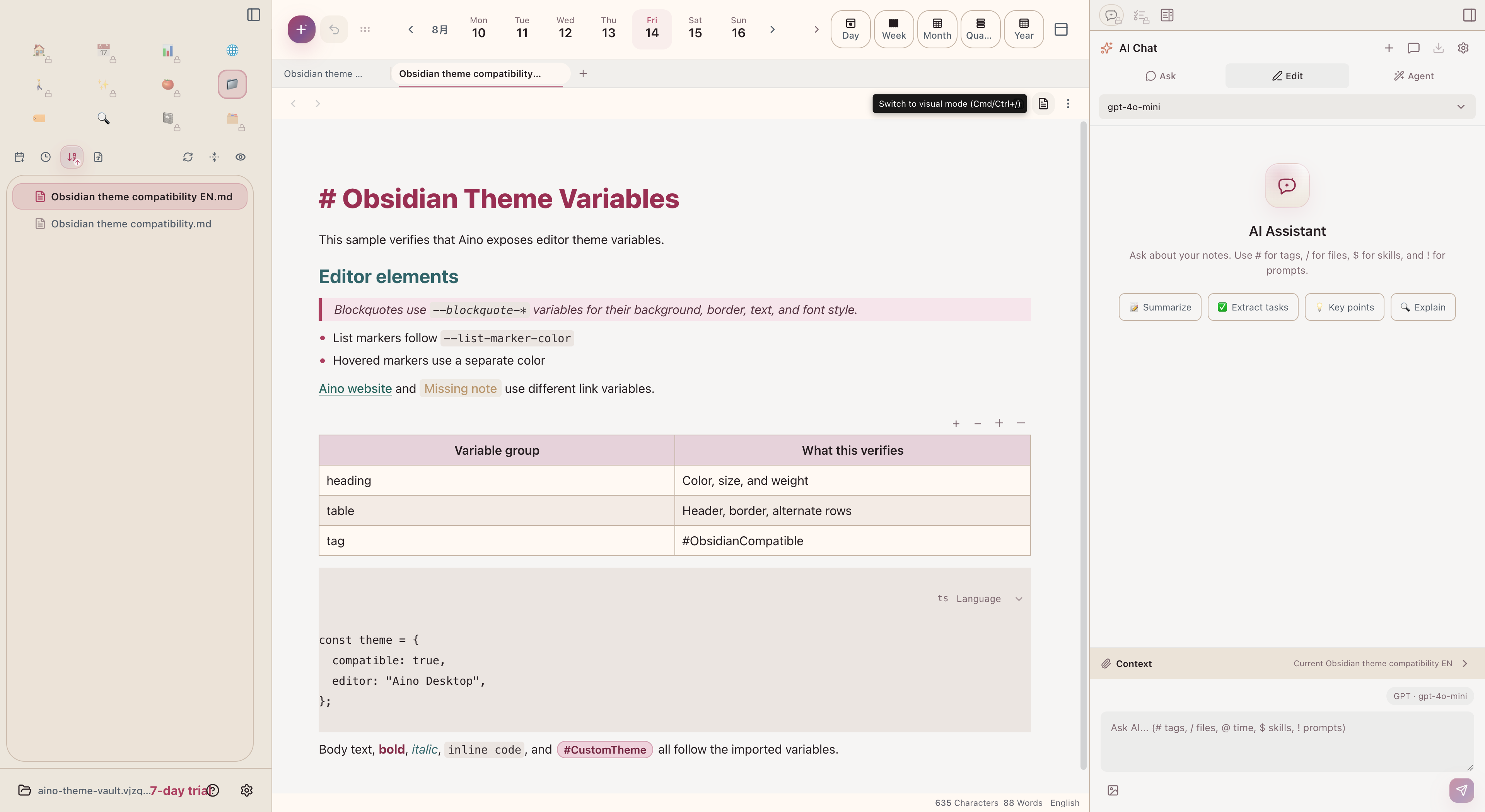
Headings, blockquotes, links, tables, code, and tags in Aino Desktop using Obsidian-compatible theme variables

This is a variable compatibility layer, not an Obsidian theme.css loader. Aino does not execute CSS selectors, var(), color-mix(), url(), or @import. When migrating an Obsidian theme, resolve those expressions to the literal colors and sizes accepted above.

Foundation variables

GroupSupported Obsidian variables
Backgrounds--background-primary, --background-primary-alt, --background-secondary, --background-secondary-alt, --background-modifier-hover, --background-modifier-active-hover, --background-modifier-border, --background-modifier-border-hover, --background-modifier-border-focus
Interactive--interactive-normal, --interactive-hover, --interactive-accent, --interactive-accent-hover
Text--text-normal, --text-secondary, --text-muted, --text-faint, --text-on-accent, --text-on-accent-inverted, --text-success, --text-warning, --text-error, --text-accent, --text-accent-hover, --text-selection, --text-highlight-bg, --caret-color, --bold-color, --italic-color
Accents--color-accent, --color-accent-1, --color-accent-2
Palette--color-red, --color-orange, --color-yellow, --color-green, --color-cyan, --color-blue, --color-purple, --color-pink
Radii--radius-s, --radius-m, --radius-l

Common foundation variables map back to Aino surfaces. For example, --background-primary controls editor paper, --background-secondary controls sidebars, --interactive-accent controls the primary accent, and --text-normal controls body text. If equivalent Aino and Obsidian variables both appear in one tokens object, the Aino variable wins. For example, --accent-primary overrides the Aino accent mapping from --interactive-accent.

Markdown editor variables

GroupSupported Obsidian variables
Headings--heading-formatting; --h1-color through --h6-color; --h1-size through --h6-size; --h1-weight through --h6-weight
Blockquotes--blockquote-background-color, --blockquote-border-thickness, --blockquote-border-color, --blockquote-font-style, --blockquote-color
Code--code-background, --code-size, --code-normal, --code-comment, --code-function, --code-important, --code-keyword, --code-operator, --code-property, --code-punctuation, --code-string, --code-tag, --code-value
Links--link-color, --link-color-hover, --link-unresolved-color, --link-external-color, --link-external-color-hover
Lists and rules--list-indent, --list-spacing, --list-marker-color, --list-marker-color-hover; --hr-color, --hr-thickness
Tables--table-background, --table-border-width, --table-border-color, --table-header-background, --table-header-border-color, --table-header-color, --table-header-weight, --table-text-color, --table-row-alt-background, --table-row-background-hover, --table-selection
Tags--tag-color, --tag-color-hover, --tag-background, --tag-background-hover, --tag-border-color, --tag-border-color-hover, --tag-border-width, --tag-radius, --tag-size, --tag-weight

Obsidian window, stacked-tab, ribbon, status bar, vault, and plugin-specific variables outside the lists on this page are not currently supported. Community-theme rules that depend on Obsidian DOM selectors are also unsupported. An unknown variable rejects the entire import and identifies the unsupported name, preventing a partially applied theme.

UI component variables

These 36 variables belong in schemes.light.tokens or schemes.dark.tokens. Omitted values retain each component's existing appearance. Light-only overrides do not carry into dark mode. The copied theme-authoring prompt includes the full supported token list and value types.

GroupSupported variables
Navigation states--nav-item-color, --nav-item-color-hover, --nav-item-color-active, --nav-item-color-selected, --nav-item-color-highlighted, --nav-item-background-hover, --nav-item-background-active, --nav-item-background-selected
Navigation weight and hierarchy--nav-item-weight, --nav-item-weight-hover, --nav-item-weight-active, --nav-indentation-guide-width, --nav-indentation-guide-color, --nav-collapse-icon-color, --nav-collapse-icon-color-collapsed
Editor tabs--tab-background-active, --tab-text-color, --tab-text-color-active, --tab-font-size, --tab-font-weight, --tab-container-background, --tab-divider-color, --tab-radius, --tab-radius-active
Modals--modal-background, --modal-border-color, --modal-border-width, --modal-radius
Inputs--input-radius, --input-font-weight, --input-border-width
Task checkboxes--checkbox-color, --checkbox-color-hover, --checkbox-marker-color, --checkbox-border-color, --checkbox-border-color-hover

Navigation variables style the file and knowledge trees, including translucent sidebars. active means the open file, selected means multi-selection, and highlighted means a reveal indicator. They do not change tree row heights or virtualization. Tab variables style editor tabs; --tab-font-weight applies to both inactive and active tabs.

Modal variables style shared form dialogs and the settings window. Input variables style shared forms, settings inputs, and file-renaming inputs. Task checkbox variables work in both the visual editor and live preview: --checkbox-color sets the completed-task background, --checkbox-marker-color sets the checkmark, and --checkbox-border-color sets the unchecked border. Their -hover variants control hover states. In-progress, cancelled, and custom tasks retain their own status colors.

The color, radius, length, font-size, and font-weight validation rules above apply. Component sizes affect their corresponding controls. Typography variables below supply theme defaults, with personal Appearance settings taking priority. See the Obsidian references for navigation, tabs, and modals.

Typography and control details

Typography, toggle dimensions, slider and icon names follow the Obsidian references for typography, toggles, sliders, and icons. Their Aino scope is listed below.

GroupVariablesScope
Fonts--font-interface-theme, --font-text-theme, --font-monospace-themeUI, body text and code defaults
Sizes--font-ui-small, --font-ui-medium, --font-ui-large, --font-text-sizeMenus and small form text, regular forms and UI baseline, settings heading, editor body text
Typography--line-height-normal, --line-height-tight, --p-spacing, --heading-spacingBody and compact line heights, paragraph spacing, space above headings; visual editor and Live Preview
Toggles--toggle-width, --toggle-radius, --toggle-thumb-color, --toggle-thumb-radius, --toggle-thumb-height, --toggle-thumb-widthSettings and shared form toggles; the track expands to contain its thumb
Sliders--slider-thumb-border-width, --slider-thumb-border-color, --slider-thumb-height, --slider-thumb-width, --slider-thumb-radius, --slider-track-background, --slider-track-heightSettings sliders; thumbs stay vertically centered
Icons--icon-size, --icon-stroke, --icon-color, --icon-color-hover, --icon-color-active, --icon-opacity, --icon-opacity-hover, --clickable-icon-radiusSidebar headers, window title bar, sidebar toggle and settings close buttons

Aino materials, menus and motion

GroupVariablesScope
Surfaces--surface-sidebar, --surface-toolbarWhole sidebar and editor top toolbar
Sidebar material--sidebar-opacity, --sidebar-blur, --sidebar-saturationBackground opacity, blur and saturation; applies while personal Sidebar translucency is enabled
Sidebar panels--sidebar-panel-background, --sidebar-panel-background-raised, --sidebar-panel-background-hover, --sidebar-panel-background-active, --sidebar-panel-border-colorPanels and interaction states inside the translucent sidebar
Menus--menu-background, --menu-border-color, --menu-radius, --menu-shadowShared file context menus and submenus
Menu items--menu-item-color, --menu-item-background-hover, --menu-item-color-hover, --menu-item-padding-x, --menu-item-padding-yText, hover states and horizontal/vertical padding
Tooltips--tooltip-background, --tooltip-color, --tooltip-radius, --tooltip-shadow, --tooltip-font-sizeApp hover tooltips
Control colors--toggle-background, --toggle-background-active, --slider-thumb-colorOff/on toggle and slider thumb backgrounds
Shadows--shadow-sm, --shadow-md, --shadow-lg, --shadow-glow, --focus-ring-shadowShared surfaces, controls, toggle glow and focus rings
Motion--motion-duration-fast, --motion-duration-normal, --motion-duration-slow, --motion-curve-soft, --motion-curve-emphasisTransitions using shared motion variables; system reduced-motion preferences still take priority
Scrollbars--scrollbar-bg, --scrollbar-thumb-bg, --scrollbar-active-thumb-bgTrack, thumb and hover color in settings, sidebars and editors; visibility is controlled by the OS

The sidebar header, launcher and content share one background layer. --surface-sidebar colors all three consistently, with translucency applied once. Embedded panels can have separate colors when explicitly customized.

Personal text size overrides --font-text-size. Personal font choices override UI and body defaults; --font-monospace-theme controls code separately. Compact density overrides body line height and spacing. Themes leave personal settings intact, and selecting a built-in preset clears theme defaults.
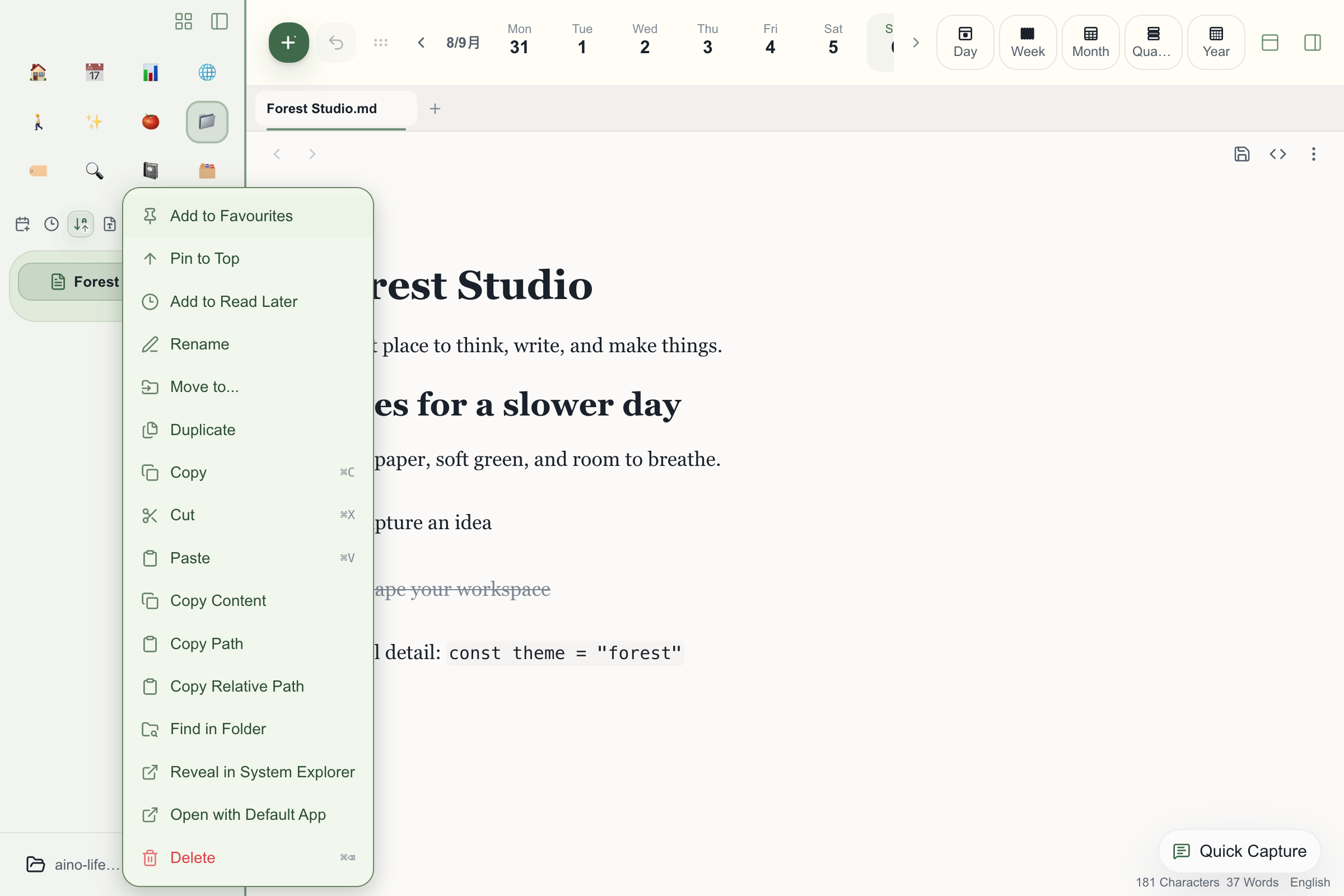
Aino Desktop with custom typography, sidebar material and context menu variables

Surfaces and editor

VariablePurpose
--surface-canvasApp canvas
--surface-panelSidebars and regular panels
--surface-elevatedDialogs, menus, and floating content
--surface-mutedSecondary regions
--surface-muted-strongStronger secondary regions
--surface-accent-softSoft accent surface
--surface-accent-soft-strongStrong soft-accent surface
--surface-success-softSoft success surface
--surface-warning-softSoft warning surface
--surface-danger-softSoft error or danger surface
--editor-surface-primaryMain Markdown editor paper
--editor-surface-secondarySecondary editor surface
--editor-surface-tertiaryTertiary editor surface
--editor-border-colorEditor borders
VariablePurpose
--text-primaryBody text and primary headings
--text-secondarySecondary text
--text-mutedHints and de-emphasized text
--text-inverseText on accent surfaces
--accent-primaryPrimary actions, selection, focus
--accent-secondaryMiddle gradient stop
--accent-tertiaryFinal gradient stop
--accent-strongHigh-contrast accents and links
--accent-softSoft accent color
--link-colorLinks
--link-hover-colorHovered links
--editor-link-colorLinks in the editor
--editor-link-hover-colorHovered links in the editor

When you override any of the three accent colors, Aino automatically rebuilds button gradients and --accent-primary-rgb. Do not declare these derived variables in the file.

Status, borders, and radii

VariableTypePurpose
--successColorSuccess state
--warningColorWarning state
--errorColorError state
--border-colorColorDefault border
--border-color-strongColorStrong border
--border-color-subtleColorSubtle border or divider
--radius-xsLengthExtra-small radius
--radius-smLengthSmall radius
--radius-mdLengthDefault radius
--radius-lgLengthLarge radius
--radius-xlLengthExtra-large radius

Validation and security limits

  • The file must be UTF-8 JSON, use a .json extension, and be no larger than 64 KB.
  • JSON comments and trailing commas are not supported.
  • An unknown variable, invalid color, out-of-range radius, or missing required field rejects the entire file; Aino never applies only part of an invalid theme.
  • Theme files cannot contain CSS, url(), @import, scripts, or network resources.
  • Importing a theme only changes presentation. It does not read or modify your notes.

Pre-publish checklist

  • Test light and dark independently.
  • Aim for at least 4.5:1 contrast for body text and 3:1 for secondary text.
  • Do not rely on red or green alone; retain Aino's icons and text labels for state.
  • Check hover, keyboard focus, disabled controls, dialogs, search results, and the Markdown editor.
  • Export the current theme as a backup before repeatedly importing revisions.

Aino AI Apps receive the same public semantic variables, so apps authored with host theme tokens also follow the user's custom theme.